Finding the perfect paint colour: Why do shade cards matter?
Choosing the perfect paint colour for your home interior can be both exhilarating and overwhelming. It is a crucial aspect of renovating your space, setting the tone for its ambience. A misstep in choosing the paint shade can disrupt the entire look, making it vital to understand the impact of each colour. That’s why the modest shade card steps are an invaluable tool in the search for the perfect colour palette.
This blog is your ultimate guide to colour selection for your interior
- The Basics of a Colour Wheel
Once you understand the basics of this colour wheel, this tool will be valuable for choosing the right colour for your place. Here are a few key points you should know while painting
- Types
Colour wheels vary widely, ranging from basic versions displaying primary colours and fundamental shades like green, orange, and purple, to complex ones featuring an extensive array of tints and shades.
- Warm Colours
On one side of the colour wheel, you will find warm colours like red, orange yellow.
- Cool Colours
On the opposite side of the wheel, you will find cool colours like blue, green, and purple.
- Monochromatic Colours
Monochromatic colour schemes in interior design have gained popularity due to their fail-safe nature. Using various shades of a single colour, like blacks and greys, creates a cohesive look. To achieve this, focus on one section of the colour wheel.
- Complementary Colours
For complementary colours that complement each other effectively, explore opposite sides of the colour wheel. For instance, pairing blues with yellows creates a harmonious combination.
- Analogous Colours
Analogous colours involve selecting colours from adjacent segments (typically three) on the colour wheel. These hues blend seamlessly, offering harmony without the stark contrast of complementary schemes. For example, green, blue, and purple or yellow, yellow-green, and green form examples of analogous colour palettes.
Understand how colour affects your room
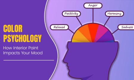
It is always a good idea to consider how the colour affects the space and mood of the room. Colours can evoke different emotions and psychological effects on people so it is important to choose wisely. Neutral colours like white and grey can help to create a calming atmosphere. Warmer colours such as red and yellow evoke feelings of energy and joy, while cooler colours such as blue and green evoke feelings of calm and relaxation. Ultimately, the goal is to create a space that is both aesthetically pleasing and functional.
Unlock the power of the shade card
A shade card is a compact yet comprehensive visual catalogue of paint colours offered by a specific brand or paint line. It showcases an array of colours within a particular spectrum, arranged systematically for easy reference. Each colour swatch is meticulously labelled, often with names or numerical codes, aiding in identification and selection.
Choose the Shade Card – your go-to tool for selecting the ideal paint shade. It is the key to achieving a luxurious, classic, or pleasant atmosphere within your space. Making the right choice from the Shade Card ensures the desired look without any mishaps that could spoil the aesthetic. Various brands have introduced different shade cards. Asian paints shade card is the most popular and oldest shade card used in the country. This shade card has 2200 curated shades and is equipped with a viewfinder that allows you to view colours in isolation and understand their exact tonality. Asian paints for interior walls are the most popular choice for Indian homes because of their superior quality and colour range. These shade cards are also useful for architects and interior designers who are looking for the perfect colour scheme for their projects. You can find all these shade cards in the shade card section of PaintKart’s site. In our store, we try to keep all the shades of paint available and the shade should be as close to what is displayed.
Navigating the spectrum
Understanding how to effectively use shade cards is key in your search for ideal colour paint. While using a shade card consider the following points.
- Context is key
Consider the context of your space. Factors like natural light, room size, existing decor, and the ambience you wish to create significantly influence the colour choice.
- The power of undertones
Consider the power of undertones as different undertones have different effects on the appearance and feel of the room. Understanding these undertones helps in harmonising with existing elements in rooms.
- Sampling is crucial
Test paint samples on your walls to observe how they interact with the room’s lighting throughout the day.
- Complementary Tones:
Explore complementary colours on the shade card. They can inspire accent walls or complementary shades that enhance the overall aesthetic.
- The Psychology of Color:
Different colours evoke distinct emotions and moods. Research the psychological impact of colours to align with the ambience you desire.
- Test, Observe, Decide:
Once you have shortlisted a few colours, obtain paint samples and apply them to your walls. Assess how the colours behave under different lighting conditions before making a final decision.
After finalizing the shade, order the exact amount of paint with PaintKart’s Paint calculator and avoid a shortage or waste of paint.
Selecting a shade card can also add an effect to the colour selection process. Different shade cards come with different categories of shade making things simpler for the customer to choose. For example – Royal shade cards exhibit the top shades available in Royal Luxury Emulsion, Royal Matt, Royal Aspira, and Royal Shyne. Specifically, the Royal Aspira Shade Card showcases the favoured hues within Royale Aspira, featuring an impressive range including Pastel Shades such as Grlic Pod Shredded Wheat, Coral Rocks, Fossil, Sunset Beach, Essence, Baked Biscuit Light Buff, and Cream Galaxy.
Final Thoughts
The journey to find the perfect paint colour is an exciting exploration of self-expression and ambience creation. The shade card serves as your trusty guide, enabling you to navigate through the vast sea of colours and find the one that encapsulates your vision. So, armed with inspiration and armed with a shade card, embark on this colourful journey to transform your living spaces into a reflection of your style and personality!
Happy Painting!!