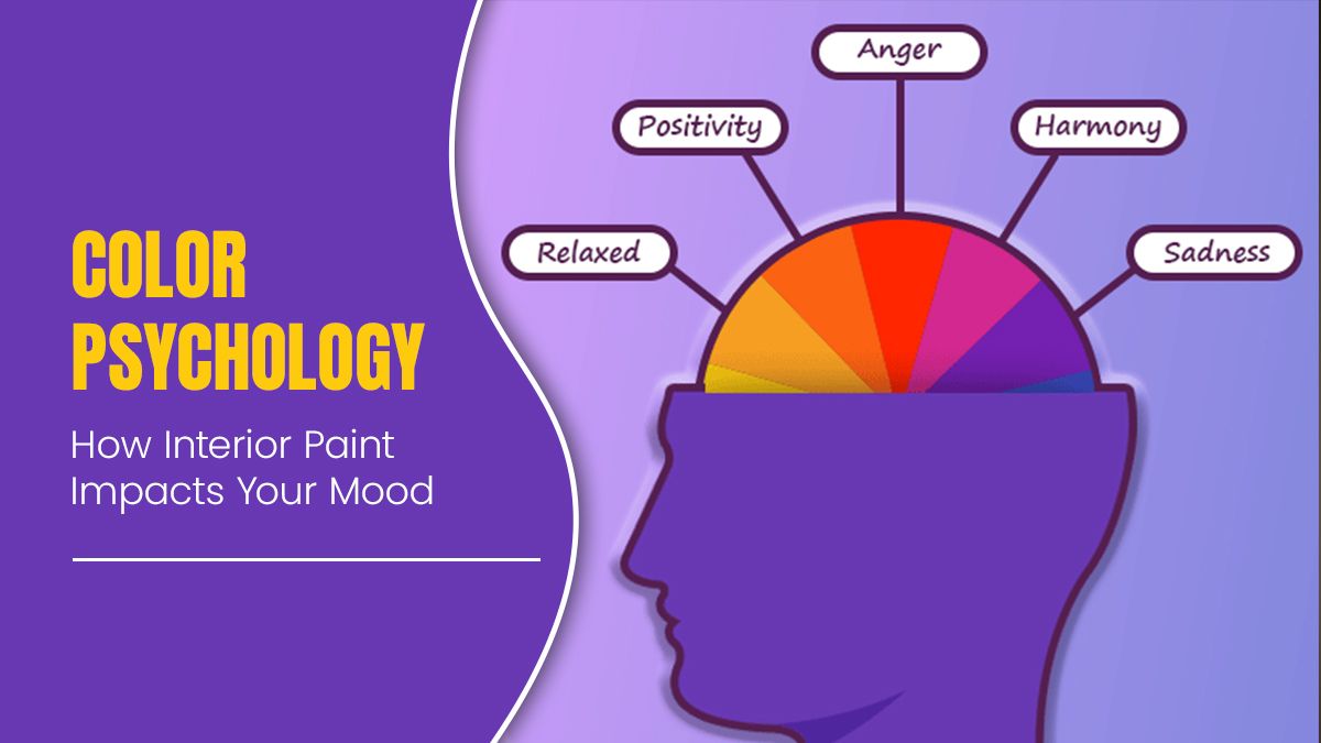
Colour Psychology: How Interior Paint Impacts Your Mood
Step into the room colour with a vibrant red and you might feel a surge of energy. Entering a room adorned in blue and tranquillity washes you over. Yellow and green evoke optimism and joy, while purple and pink evoke creativity and passion. White and grey create a sense of serenity and calmness. Choosing the right colour for your room can significantly impact your mood.
Colours have a remarkable way of influencing our emotions, behaviours, and perceptions – especially within the confines of our homes. The psychology of interior paint is a captivating subject that delves into how colours can profoundly impact our mood and overall well-being.
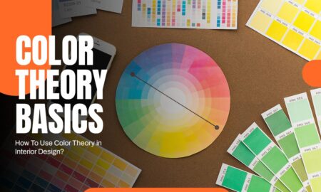
The psychology behind the colours
Colours have the remarkable ability to evoke specific feelings and emotions. Understanding this psychology helps in creating spaces that resonate with our desired ambience.
1. Cool Colour Vs Warm Colour
A colour wheel has warm hues (like red, orange, and yellow) and cool tones (such as purple, blue, and green). These labels – warm and cool – reflect how these colours typically make a room feel. Warm tones, the vibrant colours, tend to create a lively, uplifting atmosphere. They can make you feel happier and more energized upon entering a room. On the other hand, cool tones, with their tranquil shades, often induce a sense of calmness and relaxation. By choosing whether you want a room to invigorate or soothe, you can easily narrow down your colour options by half. Yet, within these warm and cool categories, each specific paint colour carries its unique influence on your mood. Understanding these effects can be a guiding factor in selecting the right colour palette for your space. The Asian Paints shade card provides a comprehensive overview of the various shades available and their potential effects on the overall look and feel of a room. It also provides tips on how to combine different hues to create the desired atmosphere.
2. Energizing red

Red, as a vibrant and intense colour, significantly boosts a room’s energy levels. Subdued shades evoke emotions like love, passion, and sensuality, while brighter tones might provoke feelings of anger, strength, or power. Overall, it is a warm, positive hue that motivates action, empowering even the most reserved individuals and boosting their confidence.
3. Tranquill Blue

Blue holds the title as the most calming colour among all hues. Its influence includes slowing heart rate, reducing respiration, and even lowering blood pressure. This calming effect explains why it is a popular choice for bedrooms. Additionally, blue is believed to curb appetite, making it a potentially suitable colour for kitchens, especially for those on a diet.
Symbolically, blue represents trust, dependability, and stability, making it the top choice for many as their favourite colour. Moreover, it aids in enhancing clarity of thought and productivity, making it an excellent option for study areas or home offices.
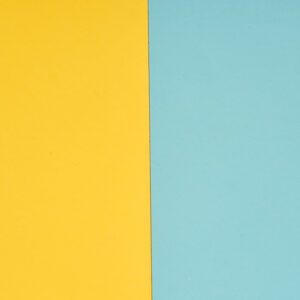
4. Optimistic Yellow

Yellow, known for its cheerful and optimistic nature, creates a joyful atmosphere, making spaces like a kitchen eating area feel uplifting. In entryways, yellow serves as a welcoming colour, leaving a strong impression, especially in a glamorous foyer. Yellow catches the eye faster than any other colour. When combined with other colours, it tends to stand out prominently. Hence, vibrant yellows often work best as accent colours or in smaller rooms to avoid overwhelming the space.
5. Balanced Green

Green has a remarkable impact on uplifting mood, particularly when feelings of sadness, hopelessness, or depression arise, owing to its strong association with nature. Recognised as the most harmonious colour, it often serves as the initial choice for individuals experimenting with colour psychology. Green promotes independence, catalyzes change, and fosters feelings of love, joy, and inner peace.
Impact on Emotions
The colours we surround ourselves with can directly impact our emotional state:
- Productivity:
Vibrant yellows or oranges can stimulate creativity and boost productivity, making them suitable for workspaces or study areas.
- Relaxation:
Soft pastels and muted tones contribute to relaxation and tranquillity, ideal for bedrooms or reading nooks.
- Social Interaction:
Warm tones like oranges and yellows promote sociability and encourage interaction, making them great for gathering spaces like living rooms.
Choosing the Right Color Scheme
When selecting colours for your interiors, consider the following tips:
- Personal Preference:
Your taste and comfort should guide your choices.
- Room Size:
Lighter shades can make small rooms appear larger, while darker tones can add cosiness to large spaces.
- Lighting:
Natural and artificial light can significantly alter how colours appear, so consider the lighting conditions in each room.
- Complementary Colors:
Harmonizing different hues can create visual interest and balance in a room. Bonus Point: – If you are looking to paint exterior walls go for the texture paint. It is resistant to intense heat, cold, sunlight, and rain. Most people use texture paint for their external painting projects to shield the walls from harsh temperature fluctuations and weather. Texture paints can withstand algae, fungus, peeling, fading, and chipping. It maintains your walls sturdy enough to withstand fluctuations in the weather for many years to come.
Conclusion
The impact of colour psychology on our moods is undeniable. The colours we choose for our interiors can uplift, calm, inspire, or energize us, influencing our emotions and behaviours within our living spaces. So, the next time you are contemplating a paint job, remember that it’s not just about aesthetics- it is about crafting an environment that resonates with your emotions and enriches your daily life. Also while considering all these factors never forget about the quality of the paint. It affects the longevity of the paint and the look and feel of the room. It is important to choose paints that are durable and resistant to fading and chipping. PaintKart India provides high-quality paint from all brands like Nerolac, Asian Paints, Berger, Dulux, etc. The Paint Calculator on PaintKart India will help you choose the right paint for your project with the required amount.