Colour Theory Basics: How To Use Color Theory in Interior Design?
Many of us must be amazed by reading the word ‘colour theory’. How conceptual it does sound. Colour theory might seem complex in interior design, but surprisingly it is simple. It is not a challenging aspect but rather a tool that enhances your skills. Understanding these basics of colour theory is like adding a “cherry on top” of your expertise in interior work. To make it simple for you, we have explained colour theory here. By mastering these, you can create harmonious and balanced colour schemes for your interiors. This blog simplifies colour theory for you.
What is Colour theory?
It is the study of colour in relation to art and design. Colour Theory explores the relationship between colour and art/design. It delves into how colours interact and their role in creating balanced compositions. Principles like hue, value, intensity, and temperature guide the selection of harmonious colours. Designers use various tints, shades, and hues or blend multiple colours to evoke emotions or share distinct messages.
How does colour theory help in home design?
In-home design colour theory comes into consideration which helps in colour hormonization. Again it becomes vital to choose the right colour, the right shade as shade can influence the mood and affect how a person feels. People generally design various parts of their homes to create different moods and ambience. As colour is the game changer in interior design it plays with human psychology and emotions to a considerable extent.
For Example:- For calm and open feelings people generally choose lighter shades whereas for bold statement feel they go with dark shades.
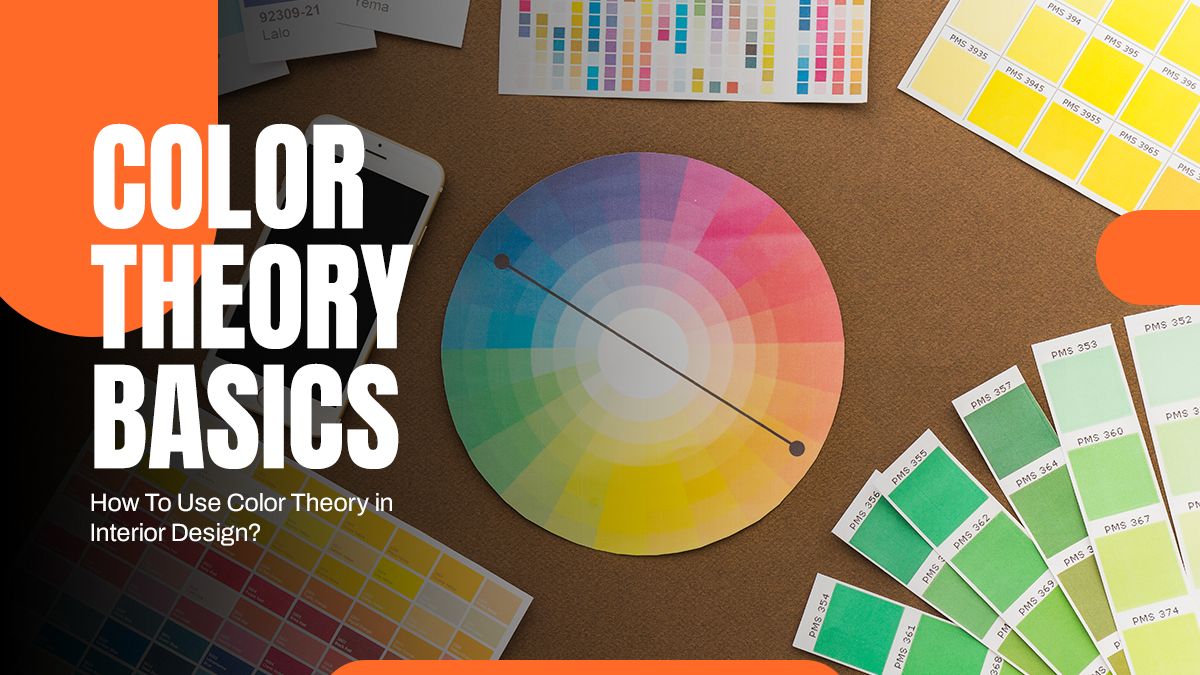
A few colour theory basics you should know in Interior Design
- Colour Wheel
The colour wheel consists of three colours
- Primary colours
Red, Yellow and Blue form the primary colour
- Secondary colours
Primary colours form secondary colours like purple, green and orange
- Tertiary colours
You can create tertiary colours by combining primary and secondary colours.
- Colour Scheme
A colour scheme involves crafting cohesive colour combinations using the colour wheel. It enhances the visual appeal and style. Examples include:
- Monochromatic: Different tones from a single hue create a unified scheme.
- Analogous: Colors adjacent to the wheel, like an ombre scheme.
- Triadic: Hues equally spaced on the wheel.
- Complementary: Colors opposite on the wheel, mixing resulting in brown.
- Tetradic: Variations of two colours evenly spread across the wheel.
- Split Complementary: One colour is split into two adjacent tones, e.g., yellow-green.
- Colour Combination
Colour combinations start with primary and move toward secondary and tertiary colours. Combination form by combining three colours with any other colours along with white.
- Colour Mixing
Understanding colour combinations is crucial for both interior designers and homeowners seeking to elevate their spaces.
Here is a breakdown:
- Hues: Colors from the colour wheel.
- Tones: Adding black or white to a colour alters its saturation, creating a toned version.
- Tints: Mixing white lightens a colour, resulting in a softer, pastel shade.
- Shades: Incorporating black deepens a colour, creating varied shades based on the amount added.
- Square Colour Scheme
A square colour scheme incorporates four equally spaced colours from the colour wheel. It consists of a primary and secondary colour alongside two tertiary colours, regardless of their positions on the wheel.
The vibrancy of these colours can differ, based on whether they are bold or neutral. Similar to the triadic scheme, designers aim for a balance between warm and cool tones. They often choose a dominant shade and three accent shades to achieve this balance.
Tips to use colour theory basics in interior design
- Pick Any Colour
Yes! You read it correctly, pick any colour and just begin.
With the help of the above tips choose any colour according to the client’s requirements or ambience you want to create. Once you have chosen your primary colour, you can move on to choosing your accent colours. Make sure to consider the undertones of the colours and how they will interact with each other. Finally, with the help of the colour wheel, you can experiment with different combinations until you find the perfect balance. Pick any shade of any colour from the PaintKart India online store. From Nerolac, Barger, Dr Fixit, Dulux, etc to Asian Paints for interior, exterior, wood paints, and texture paints we are suppliers of the brands.
- Pick a colour scheme from a large pattern or space
Consider the pattern or element in your space and go with the complementary colour of that element. For example, if the larger space of a home is blue then go with a colour which is complementary to the blue.
- Dark to light shade – Vertically
Interior designers commonly employ a ‘dark to light’ vertical arrangement within a space. This involves darker hues for floors and progressively lighter tones for walls. This technique creates an illusion of expanded space.
- The 60-30-10 Rule
Follow the 60-30-10 colour rule. Choose the 60% dominant colour means 60% of the wall forms from the dominant colour whereas 30 forms with the secondary colour typically for upholstery and the remaining 10 will be the accent colour used for accessories. This ratio will maintain the balance.
- The contrast between warm and cool
Never consider natural colour as dull! They offer balance and harmony to a space and complement both warm and cool tones effortlessly. Try combining greys with warm honey tones as an excellent pairing example. Make a use of shade card to identify the warm and cool tones. Asian paints shade card offers basic colour shades including red, orange, blue, purple, cool neutral and warm neutral. You can find this shade card online on our website. Asian Paints offers a variety of shades within a hue, allowing you to select the perfect one for your space.
- Use Colour Based Emotions
Different colours have different emotions. It influences the ambience and mood of the space. Pick the colour based on the emotions. For example, the white colour shade is always associated with peace, and innocence, whereas the darker shade of purple marks the richness and royalty.
Conclusion
Colors hold significant meaning. Colour theory is incredibly valuable for mastering colour combinations. Whether you are an Interior designer or homeowner you need to invest time in understanding the colour wheel’s potential. Expertise in leveraging the colour wheel to blend hues easily and craft ideal colour palettes for every room benefits you only. Along with the understanding of colour theory, expert consultation will add value during online colour selection. Connect with the experts at PainKart and buy paint online with us.
Happy Painting!!